Source: securityboulevard.com – Author: hrbrmstr
The days are getting shorter and when we were visiting Down East Maine the other week, there was just a hint of some trees starting to change up their leaf palettes. It was a solid reminder to re-up my ~annual “foliage” plotting that I started way back in 2017.
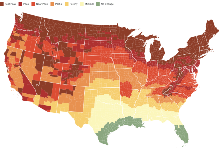
The fine folks over at Smoky Mountains — (“the most authoritative source for restaurants, attractions, & cabin rentals in the Smoky Mountains”) — have been posting an interactive map of ConUS foliage predictions for many years and the dataset they curate and use for that is also very easy to use in R and other contexts.

This year, along with the usual R version, I have also made:
- an Observable Notebook version, using data wrangled from the R version
- a Quarto project version (see it rendered, here) that was made almost solely using my Reveal QMD Chrome Extension, which turns Observable notebooks into QMD projects with one click
- and a LitElement + Observable Plot + Tachyons CSS + Vanilla JS version (see it live, here)
The only real changes to R version were to add some code to make a more usable JSON for the JavaScript versions of the project, and to take advantage of the .progress parameter to {purrr}’s walk function.

The Observable notebook version (one frame of that is above) makes use of Observable Plot’s super handy geo mark, and also shows how to do some shapefile surgery to avoid plotting Alaska & Hawaii (the Smoky Mountains folks only provide predictions for ConUS).
After using the Reveal QMD extension to make the Quarto project, the qmd document rendered fine, but I tweaked the YAML to send the output to the GH Pages-renderable docs/ directory, and combined some of the OJS blocks to tighten up the document. You’ll see some Quarto “error” blocks, briefly, since there the QMD fetches imports from Observable. You can get around that by moving all the imported resources to the Observable notebook before generating the QMD, but that’s an exercise left to the reader.
And, since I’m a fan of both Lit WebComponents and Tachyons CSS, I threw together a version using them (+ Observable Plot) to further encourage folks to get increasingly familiar with core web tech. Tachyons + Plot make it pretty straightforward to create responsive pages, too (resize the browser and toggle system dark/light mode to prove that). The Lit element’s CSS section also shows how to style Plot’s legend a bit.
Hit up the GH page to see the animated gif (I’ve stared at it a bit too much to include it in the post).
Drop any q’s here or in the GH issues, and — if anyone makes a Shiny version — please let me know, and I’ll add all links to any of those here and on the GH page.
FIN
While it is all well and good to plot foliage prediction maps, please also remember to take some time away from your glowing rectangles to go and actually observe the fall palette changes IRL.
*** This is a Security Bloggers Network syndicated blog from rud.is authored by hrbrmstr. Read the original post at: https://rud.is/b/2023/09/09/foliage-2023/
Original Post URL: https://securityboulevard.com/2023/09/foliage-2023/
Category & Tags: Data Security,Security Bloggers Network,data wrangling,DataVis,DataViz,ggplot,Javascript,Observable – Data Security,Security Bloggers Network,data wrangling,DataVis,DataViz,ggplot,Javascript,Observable
Views: 1