Source: www.troyhunt.com – Author: Troy Hunt
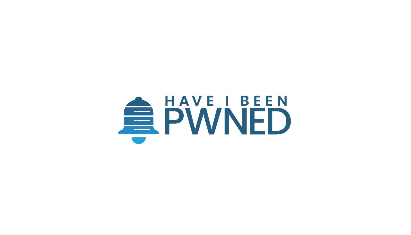
Designing the first logo for Have I Been Pwned was easy: I took a SQL injection pattern, wrote “have i been pwned?” after it and then, just to give it a touch of class, put a rectangle with rounded corners around it:

Job done! I mean really, what more did I need for a pet project with a stupid name that would likely only add to the litany of failed nerdy ideas I’d had before that? And then, to compress 11 and a bit years into a single sentence: it immediately became unexpectedly popular, I added an API and a notification service, I said “pwned” before US Congress, I added Pwned Passwords, went through a failed M&A, hired a developer and basically, devoted my life to running this service. There’s been some “water under the bridge”, so to speak.
The rebrand we’re soft-launching today has been a long time coming, and true to that form, we’re not rushing it. This is a “soft launch” in that we’re sharing work in progress that’s sufficiently evolved to put it out there to the public, but you won’t see it in production anywhere yet. The website is no different, the social channels still have the same hero shots and avatars etc. This is the time to seek feedback and tweak before committing more effort into writing code and pushing this to the masses.
A quick primer on “why”, as the question has come up a few times whilst previously discussing this. Assume for a moment that my valiant 2013 attempt at a logo was, itself, aesthetically sufficient. It’s a hard one to use in different use cases (favicon, merch) and it’s quite “busy” in it’s current form with no easily recognisable symbol which makes it hard to apply to many use cases. And there are loads of use cases; I mentioned a couple just now, but how about in formal documents such a the contracts we write for enterprise customers? Or as it appears on Stripe-generated invoices, stickers, my 3D printed logos, email signatures and so on and so forth. And branding isn’t just a logo, it’s a whole set of different use cases and variants of the logo and colours such that you have flexibility to present the brand’s image in a cohesive, recognisable fashion. Branding is an art form.
At one point there, I’d had a go at redoing the logo myself. It was terrible. You know how you can have this vision of something aesthetic in your mind and know instantly if it’s the right thing when you see it, but just can’t quite articulate it yourself? I’m like that with interior design… and logos. So, I reached out to Fiverr for help, and immediately regretted it:
I mean… wow. Ok, I get free revisions, let’s give the designer another chance:
Dammit! This just wasn’t going to work, and we were going to need to make a much more serious commitment if we wanted this done right. So, we went to Luft Design in Norway as Charlotte and Mikael went way back, and with his help, we went around and around through various iterations of mood boards, design styles, colours and carved out time in Oslo during our visit there in December to sit with Stefan as well and really nut this thing out. I was adamant that I wanted something immediately recognisable but also modern and cohesive without being fussy. Basically, give me everything, which Mikael did:
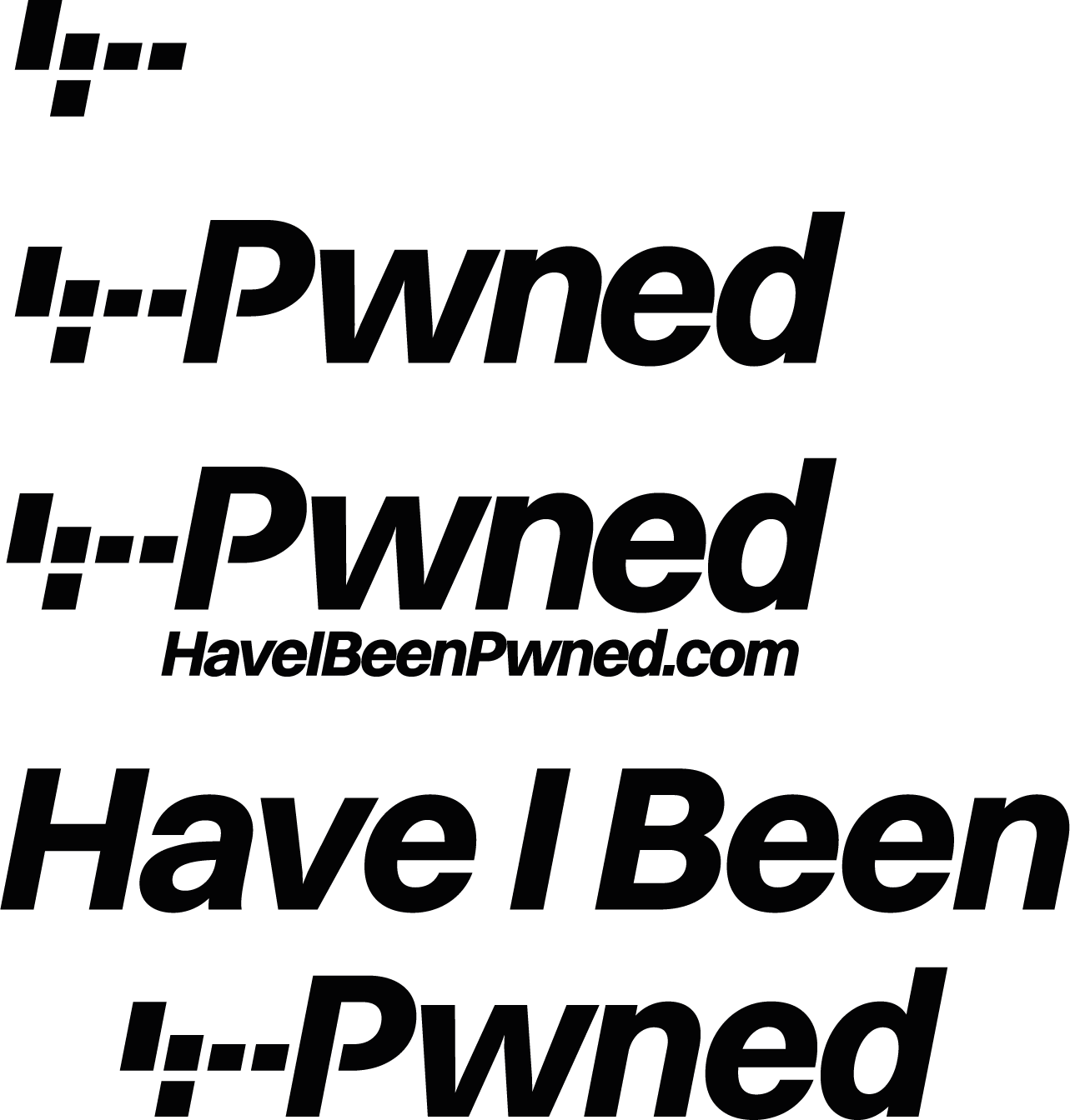
Let me talk you through the logic of these three variations, beginning with the icon. Mikael initially gave us multiple possible variations of a totally different icons which implied different things. My issue with that is you have to know what the symbology means in order for it to make sense. Perhaps if you’re starting from scratch that can work, but when you’re a decade+ into a name and a brand, there’s history that I think you need to carry forward. One of the variations Mikael did reused that original SQL injection pattern I applied to the logo back in 2013 and just for the sake of justifying my choice, here’s what it means for the uninitiated:
Take a SQL query like this:
SELECT * From User WHERE Name = 'blah'Now, imagine “blah” is untrusted user input, that being data that someone submits via a form, for example. They might then change “blah” to the following:
blah';DROP TABLE USERWe’ll shortcut the whole SQL injection lesson about validation of untrusted data and parameterization of queries and just jump straight to the resultant query:
SELECT * From User WHERE Name = 'blah';DROP TABLE USER'And now, due to the additional query appended to the original one, your user table is gone. However… the SQL has a syntax error as there’s a rogue apostrophe hanging off the end, so we fix it by using commenting syntax like so:
blah';DROP TABLE USER;--Chief among the characters in that pattern are these guys:
';--And that’s the history; these are characters that play a role in the form of attack that has led to so many of the breaches in HIBP today. Turns out they’re also really easy to stylise and represent as a concise logo:

We agonised over variations of this for months. The problem is that when you think about all the ones that are really recognisable without accompanying words, they’re recognisable because the brand is massive. The Nike swoosh, the Mitsubishi diamonds, the Pepsi circle, the Apple logo etc. HIBP obviously doesn’t have that level of cachet, but I really like the simplicity of reach of those, and that’s what we have with this one as well as that connection to the history of the brand and the practical use of those characters.
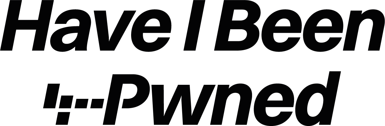
But just as with many of those other recognisable logos, these are times when what is effectively just a logo alone isn’t enough, so we have the longer form version:

“Have I Been Pwned” is a mouthful. It’s not just long to say, it’s long to put on the screen, long to print as a sticker, long to put on a shirt and so on and so forth. “Pwned”, on the other hand, is short, concise and, I’d argue, has acheived much greater recognition as a word due to HIBP. Reading how “PWNED” went from hacker slang to the internet’s favorite taunt, I think that’s a fair conclusion to draw. For a moment, we even toyed with the idea of an actual rename to just “Pwned” and looked at trying to buy pwned.com via a broker which, uh, didn’t work out real well:
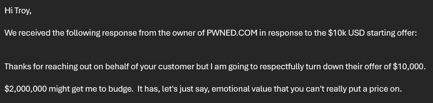
Appartently, you can put a price on it! So no, we’re not renaming anything, we’re just providing various stylistic options for representing the logo. This is why we still have the much wordier versions as well:

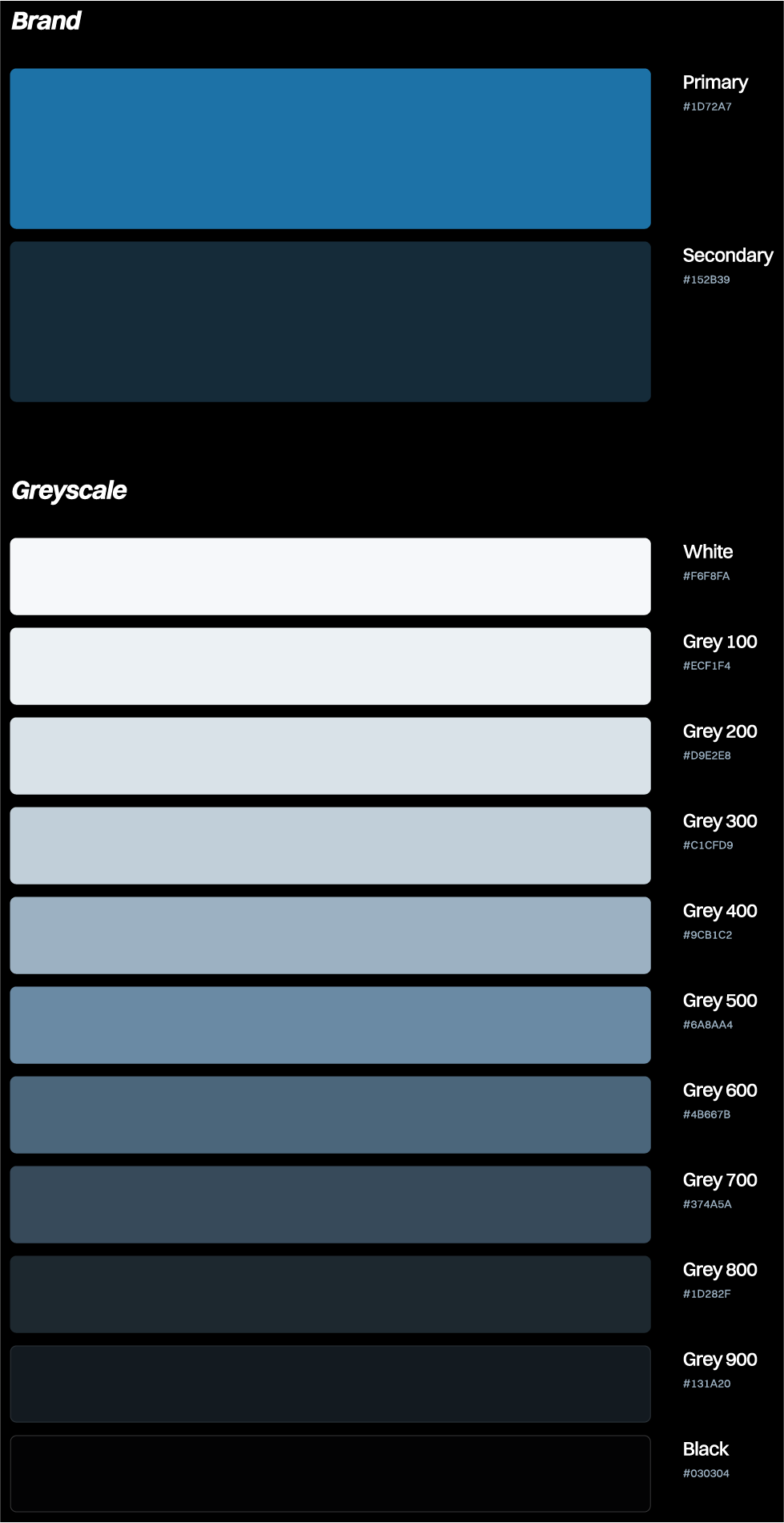
Unlike old mate at Fiverr, a proper branding exercise like Mikael has done goes well beyond just the logo alone. For example, we have a colour palette:
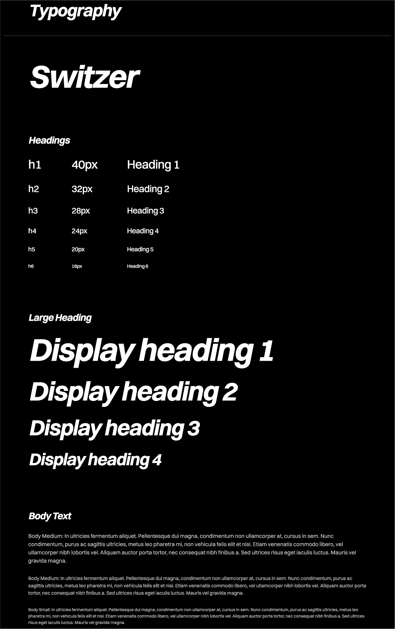
And we have typography:
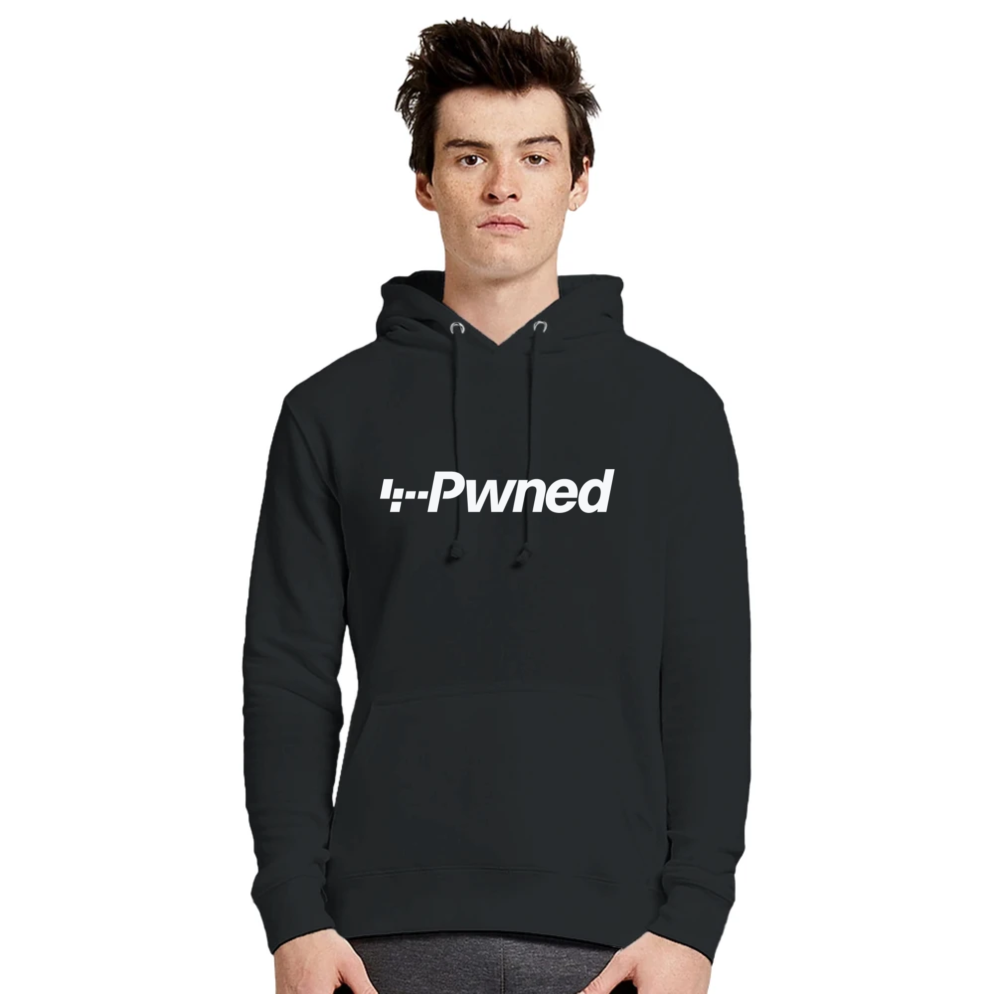
Hoodies:
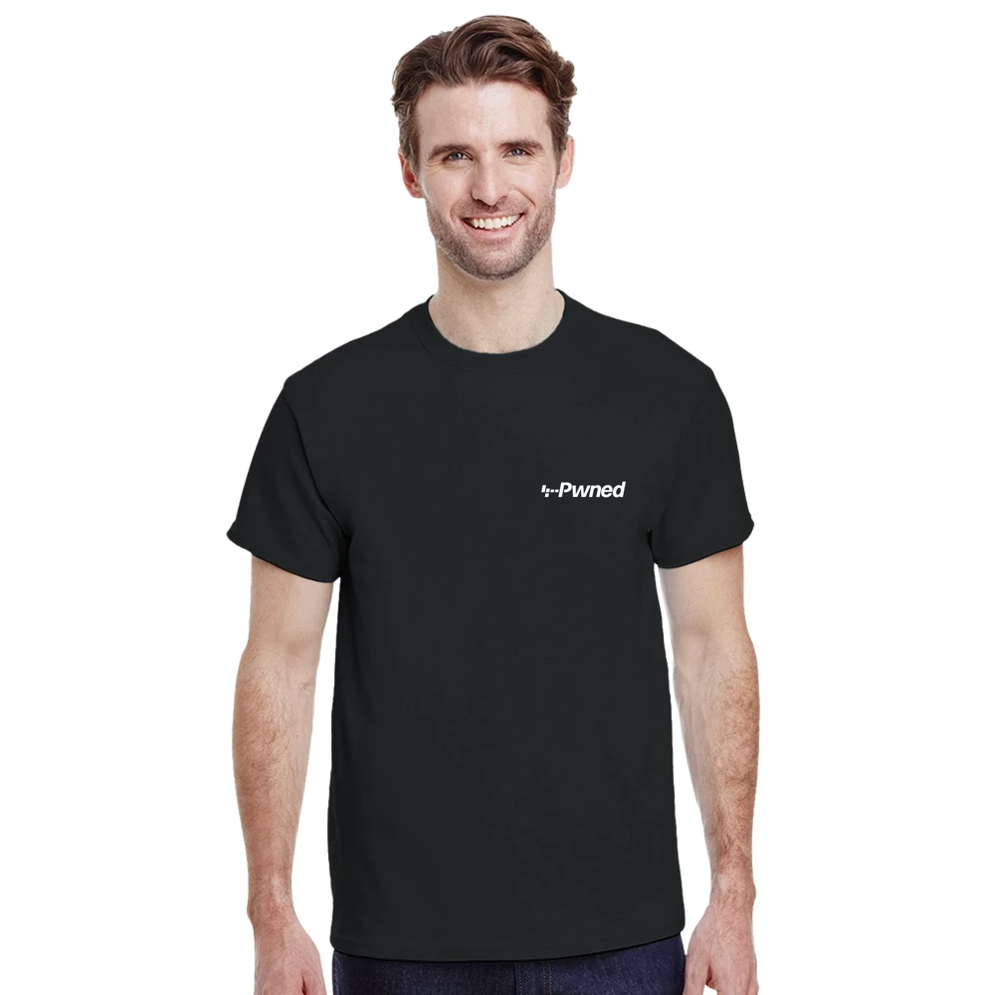
And t-shirts:
You get the idea.
But most importantly, there’s the website. Obviously the brand needs to prevail across to the digital realm, but there’s also the issue of the front-end tech stack we build on, and that’s something I’ve been thinking about for months now:
In 2013, I built the front end of @haveibeenpwned on Bootstrap and jQuery. In 2025, @stebets and I are rebuilding it as part of a rebrand. What should we use? What are the front end tools that make web dev awesome today? (vanilla HTML, CSS and JS aside, of course)
— Troy Hunt (@troyhunt) December 27, 2024
You can read all sorts of different suggestions in that thread but in the end, we decided to keep it simple:
- Bootstrap 5
- Vanilla JS (i.e. just write JavaScript without a framework dependency like jQuery)
- Sass (which compiles to CSS anyway)
And that’s it. Except Stefan and I are busy guys and we really didn’t want to invest our precious cycles rebuilding the front end, so we got Ingiber Olafsson to do it. Ingiber came to us via Stefan (so now we have two Icelanders, two Norwegians and… me), and he’s been absolutely smashing out the new front end of HIBP:
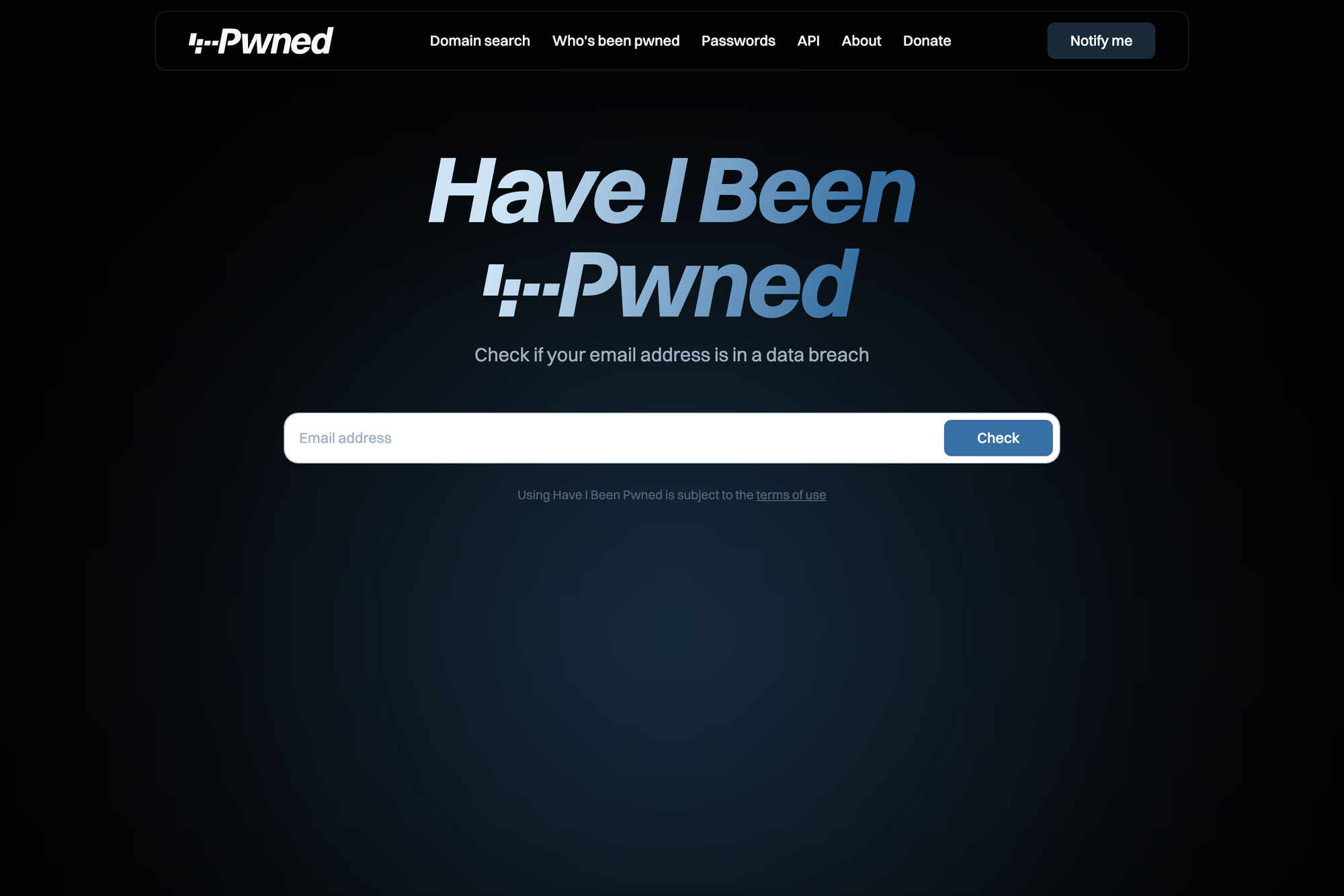
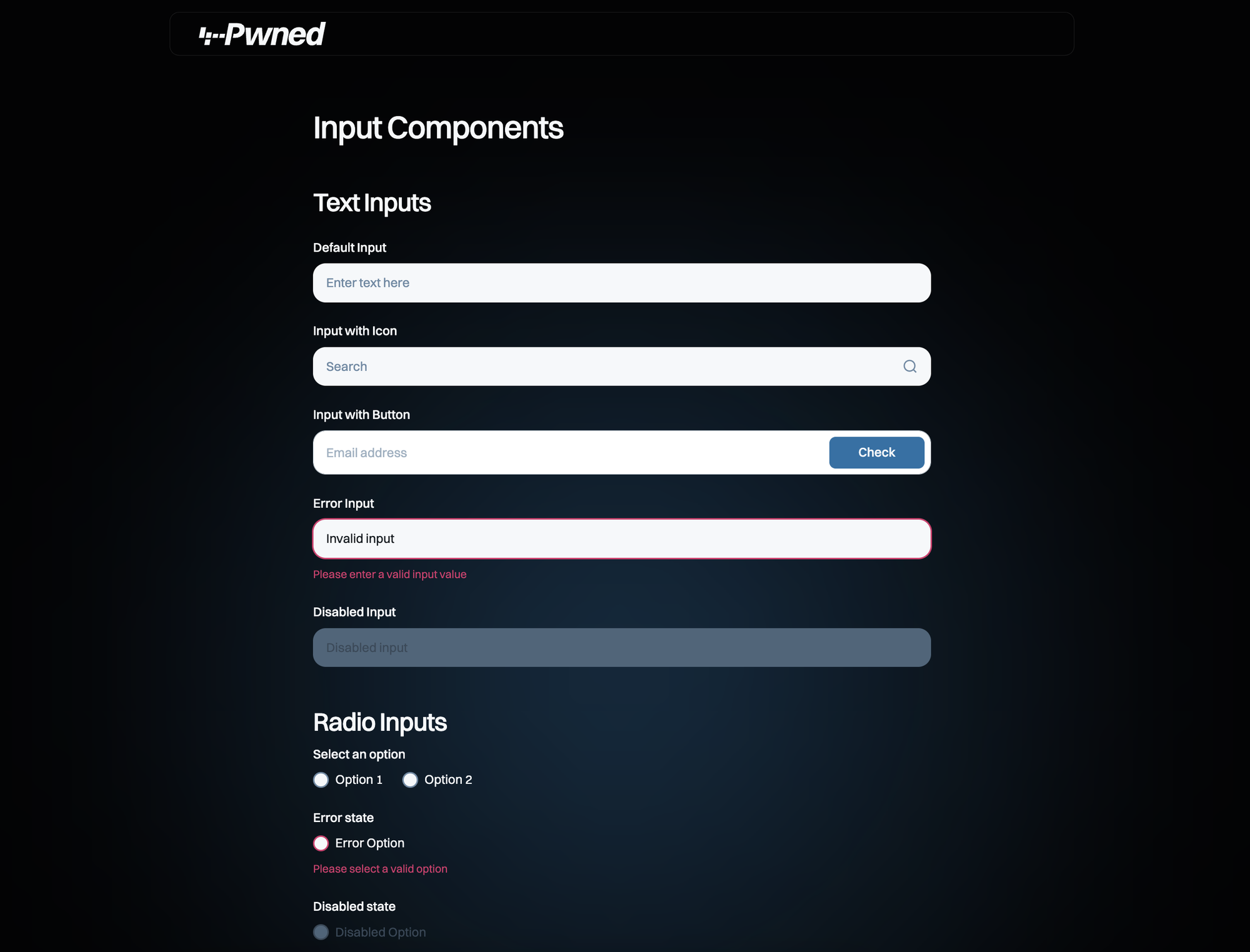
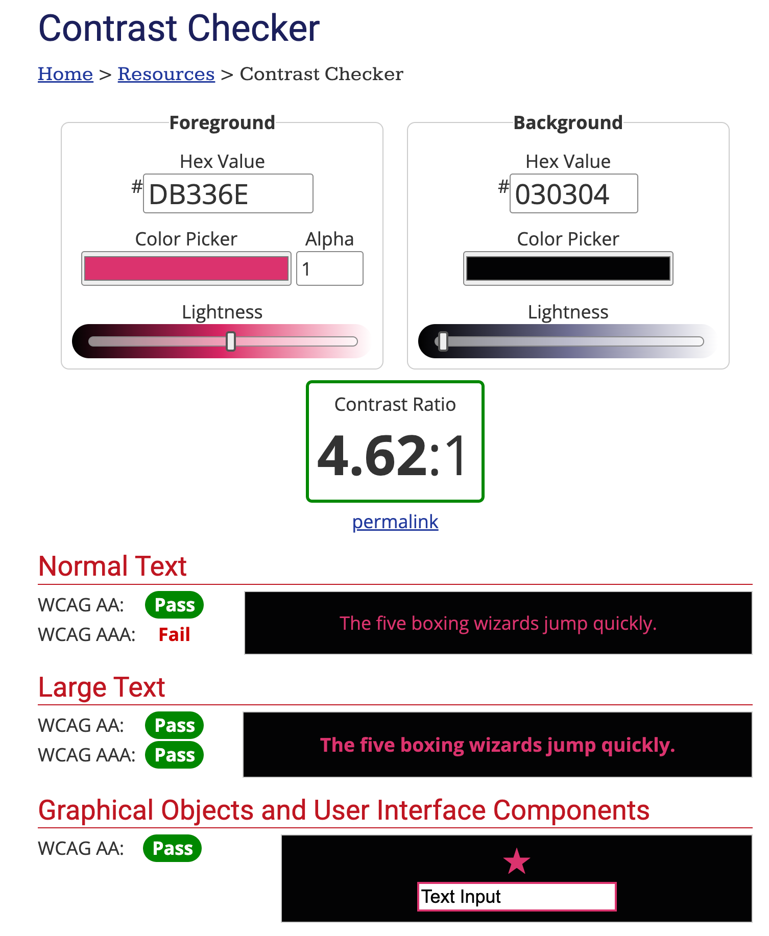
What I’ve really enjoyed with Ingiber’s approach is that everything he’s built is super clean, lightweight and visually beautiful (based on Mikael’s work, of course). I’ve really appreciated his attention to detail that isn’t always obvious too, for example making sure accessibility for the visually impaired is maximised:
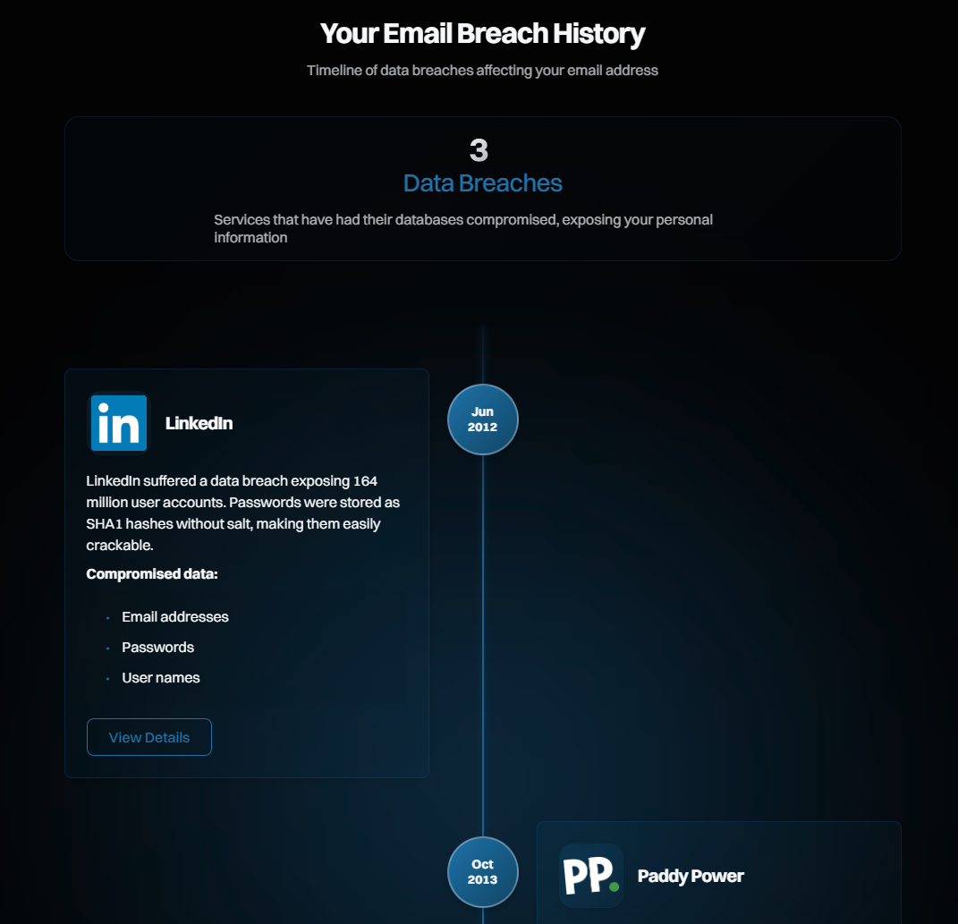
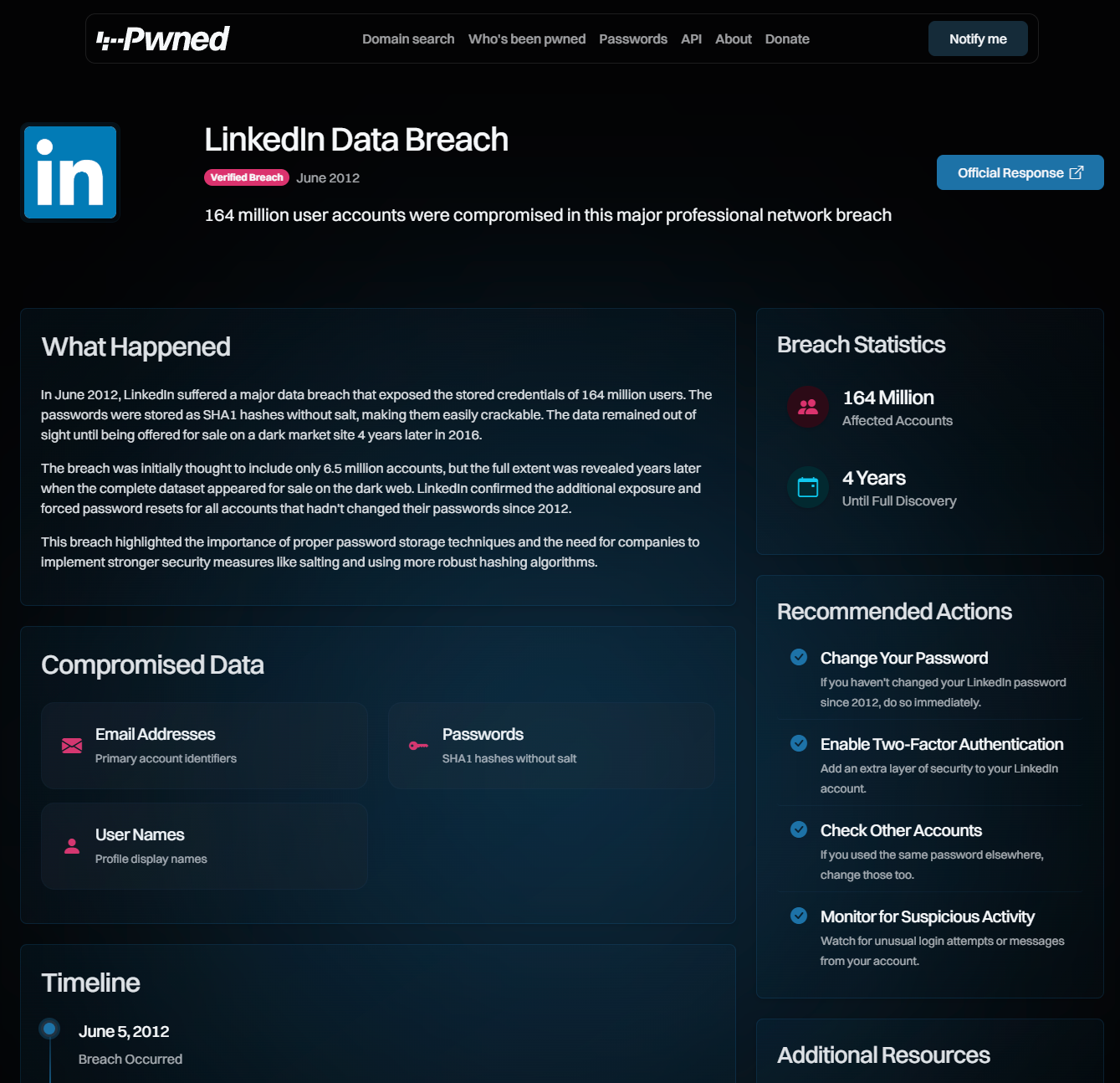
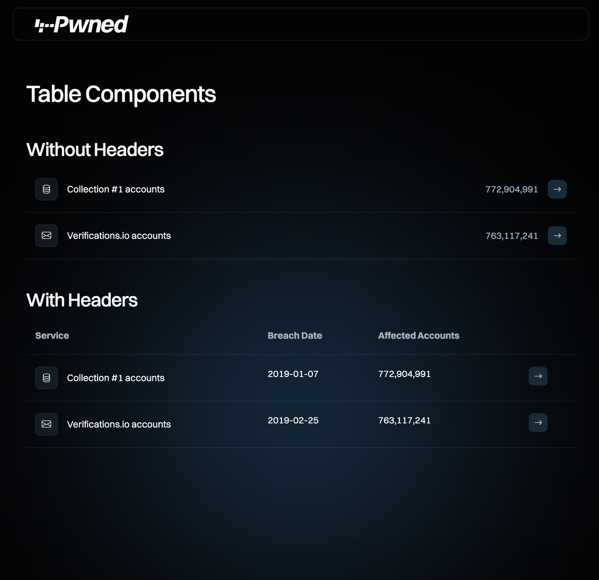
Ingiber has helped get us to the point where very soon, Stefan and I will begin the integration work to roll the new brand into the main website. That’s not just branding work either as the UX is getting a major overhaul. Some stuff is fairly minor: the list of pwned websites is now way too large and we need to have a dedicated page per breach. Other stuff is much more major: we want to have a specific “login” facility (quoting as it will likely remain passwordless by sending a token via email), where we’ll then consolidate everything from notification enrolment to domain management to viewing stealer logs. It’s a significant paradigm shift that requires a lot of very careful thought.
A quick caveat on the examples above and the others in the repository: we’ve given Ingiber free reign to experiment and throw ideas around. As a result, we’ve got some awsome stuff we hadn’t thought about before. We’ve also got some stuff that will be infeasible in the short term, for example, a link through to the official response of the breached company and the full timeline of events. I hope ideas like this keep coming (both from Ingiber and the community), but just keep in mind that some things you see in this repo won’t be on the website the day we roll all this out.
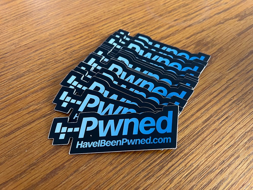
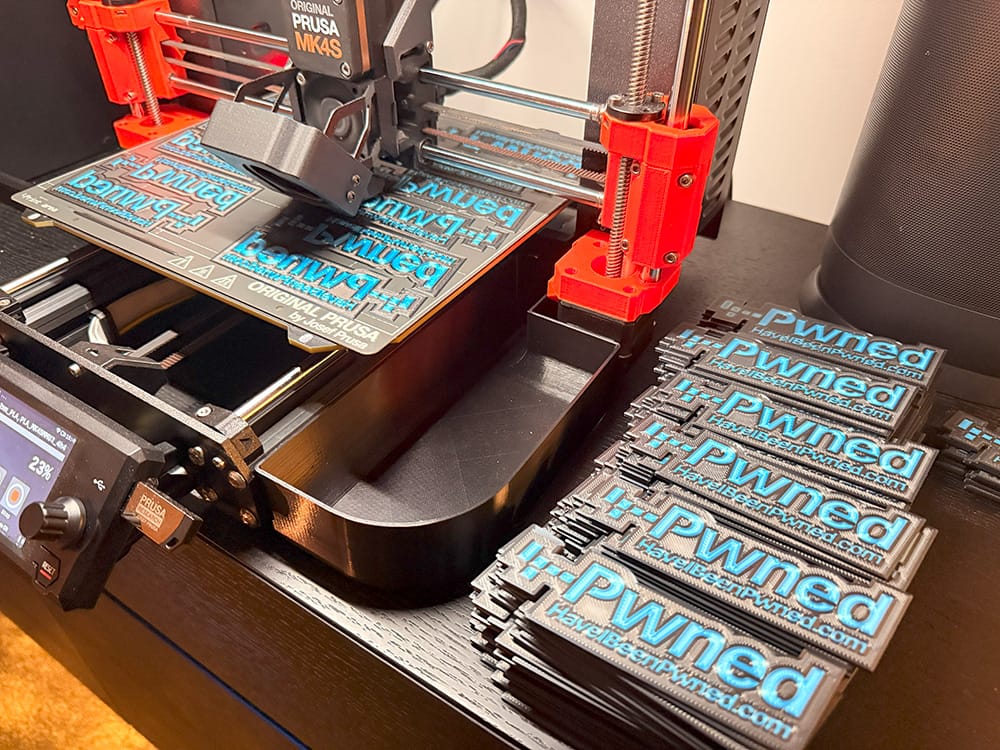
As with so much of this project since day one, we’re doing this out in the open for everyone to see. Part of that is this blog post heralding what’s to come, and part of it is also open sourcing the ux-rebuild repository. I actually created that repo more than a year ago and started crowd-sourcing ideas before closing it off last month whilst Ingiber got working. It’s now open again, and I’d like to invite anyone interested to check out what we’re building, leave their comments (either here on in the repo), send PRs and so on and so forth. I’m really stoked with the work the guys I’ve mentioned in this blog post have done, but there will be other great ideas that none of us have thought of yet. And if you come up with something awesome, we already have truckloads of stickers and 3D printed logos I’d love to send you:
So there we have it, that’s the rebrand. Do please send us your feedback, not just about logos and look and feel, but also what you’d like to see UX and feature wise on the website. The discussions list on that repo is a great place the chime in or add new ideas, or even just the comments section below 👇
Edit: Wow, all the responses have been awesome! Gotta be honest, I was nervous redefining the brand after so long, but I couldn’t have hoped for a better response 😊 I have two quick additions to this post:
- Due to popular demand, I’ve opened a store on Sticker Mule where you can now purchase the stickers. These are listed at their cost price, there’s no markup from us, just enjoy them and share liberally.
- I should have thought of this before publishing this post, but we’ve now published the static HTML pages to preview.haveibeenpwned.com. This is running on Cloudflare pages and is auto-deployed on each GitHub merge into main, so you’ll see this continue to evolve over the coming weeks.
Original Post URL: https://www.troyhunt.com/soft-launching-and-open-sourcing-the-have-i-been-pwned-rebrand/
Category & Tags: Have I Been Pwned – Have I Been Pwned
Views: 0